Björn Johansson's Garamond Corpus

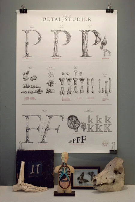
Stockholm-based graphic designer/illustrator/typographer extraordinaire, Björn Johansson, has recently unveiled his latest anatomical typography project, Garamond Corpus. What began as an exploration into the literal nature of typeface anatomy, has turned into a truly cohesive anatomical deconstruction of typography. What I appreciate about Björn is his attention to detail and the cleanliness of his designs.
Björn explains his inspiration:
“My purpose was to examine the individual letter, its shape and typographic qualities. Our letters have many characteristics comparable to the human: there’s big and small letters, thin and fat, there’s an indication of movement in the italic letter and every upper-case letter has a younger sibling, the lower-case.
Within the field of typography we have a definition for the different parts of the letter which is called the anatomy of the typeface and partly reminds of our own anatomy: the letters have arms and legs, eyes and ears, spines et cetera.”
View more of Björn's work on his Behance!


