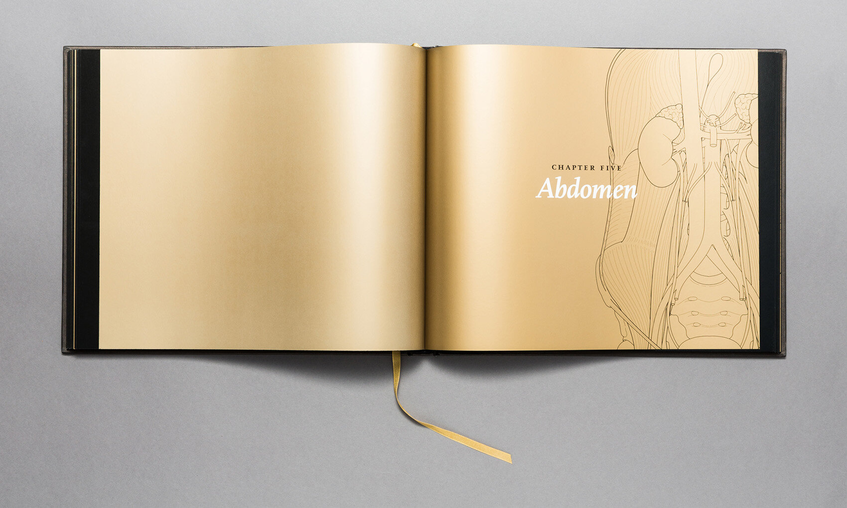
Anatomy in Black by Emily Evans
“Anatomy in Black bridges the gap between academic text and pop culture.”
We often think of anatomy textbooks as belonging in the cadaver lab or lecture hall. Or worse, abandoned on a library shelf long after they’ve served their educational purpose. Even for an artist, anatomy books might lie scattered around a studio, used only as reference. The common perception is that anatomy texts are functional. They’re rarely appreciated as a thing of beauty.
Anatomy in Black by Anatomist & Medical Artist Emily Evans contradicts everything an anatomy text has been and serves to be—elevating it as a thing of beauty and prestige.
We have been friends for over 4 years drawn together by our mutual love of contemporary anatomical art. Emily broke out of the traditional mold of a medical illustrator to create elegant anatomical products of the highest quality. She gives the public a beautifully accessible perspective on anatomy.
I caught up with Emily during her book launch at the Morbid Anatomy Museum (permanently closed) in Brooklyn to chat about Anatomy in Black and her motivation behind it.
Street Anatomy: Why anatomy in black and gold?
Emily Evans: I wanted to create a sophisticated and luxurious book of anatomy. The perfect object to have on your coffee table to dip into or spark conversations when guests are over for cocktails. A sexy anatomy book if you like!
The fact that it’s in black and gold is special, as no anatomical images are seen like that. By it not being a normal color scheme, it makes the images look like abstract shapes that feel organic. This creates interesting and beautiful patterns that take anatomy completely out of its normal context. The color scheme is stripped back to something that is beautiful and sophisticated so you don’t have the colors and imagery that people are often put off by with anatomy. Even medically trained people can look at it in a different context and see things they haven’t noticed before.
SA: When did your obsession with anatomy begin?
EE: When I was a kid I always loved how stuff was put together and how it works. I saw the human body as this ultimate piece of engineering—this ultimate machine. Anatomy to me is about life and the miracle of the engineering of it from a scientific perspective. I’m not an art historian, I’m interested in what’s beyond for anatomy.
SA: This idea of the body as the ultimate machine is interesting because your illustrations are so crisp and clean, almost like technical engineering diagrams. Tell us about the style of the illustrations.
EE: I wanted it to be really contemporary with a very crisp and clean digital line. This reflects how most anatomical imagery is depicted these days. Many people think that these simple line drawings are easy and quick to make, but it took years to master the simplicity of line. You don’t just type the word “Skull” into the computer and have it draw it for you!
SA: Is the book simply a beautiful coffee table book or is it still an educational tool?
EE:Anatomy in Black contains precise anatomical content. I wanted it to have the same level of content that I teach my medical students in the dissection room at Cambridge University. All of the information and attention to detail comes from 14 years of teaching anatomy alongside illustrating high profile anatomy textbooks.
Anatomy shouldn’t be intimidating nor should it be difficult to learn. I want people to be drawn to the book that aren’t just academics. Anatomy in Black bridges the gap between academic text and pop culture.
Thank you Emily!
Anatomy in Black has a gold foil embossed black hardback cover, with black sprayed eyes and a gold ribbon making it a beautiful object to adorn any anatomy enthusiasts’ home.


