1950-1970: Anatomy as a Graphic Form

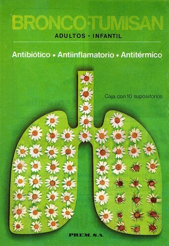
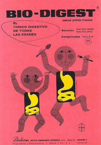
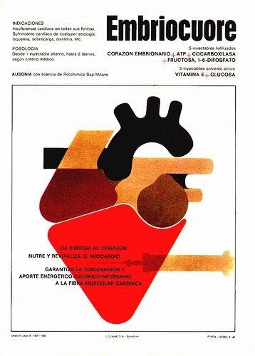
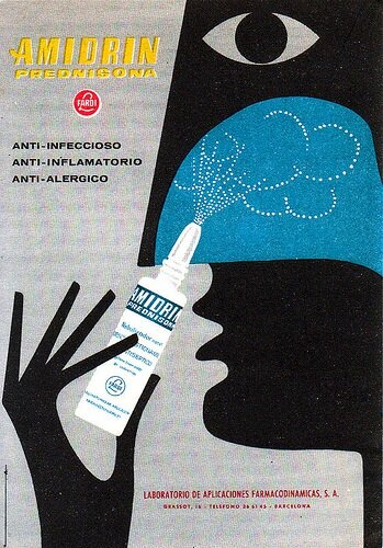
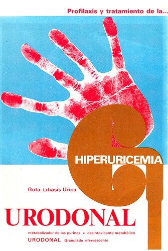
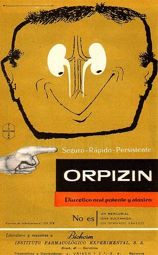
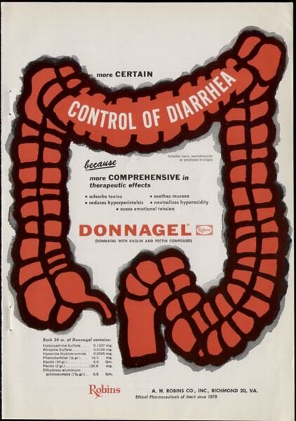
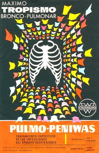 Here is a collection of Spanish pharmaceutical ads from the 50s, 60s, and 70s that incorporate anatomy as elements of design combined with some great typography.These aren't real medical illustrations intended to educate like we're so used to seeing. They're highly stylized graphic forms. The great thing about anatomy is that it can be represented in its most simple form and people will still recognize what it is. Accuracy is sacrificed for design.I think it's a bit unfortunate that we don't see this style of pharmaceutical print ad anymore. There doesn't seem to be any sort of design sense left in pharmaceutical ads, so it's refreshing to look back at this style of advertising. Many of today's pharmaceutical print ads seem to follow a standard template and there's usually a photo of a happy person running through a field (ok not really, but I feel like I've seen it too many times). There's not much creativity to them and they end up coming across as boring and monotonous.Take a look at a recent Zetia ad at the bottom of this post and compare it to the other ads. Maybe you'll see what I'm saying.[The Spanish pharmaceutical ads below are via ex.novo]
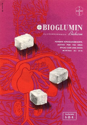
_____________________________________________________________________
 Compare this recent pharmaceutical ad with the vintage ads above. Which do you find more interesting?